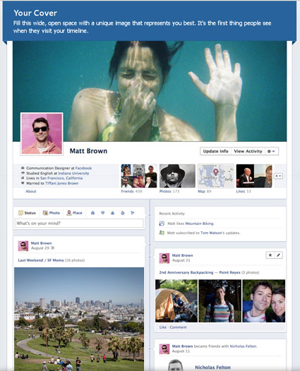
Facebook is used by many businesses in order to promote their brands and as an online marketing tool. A recent overhaul by Facebook is the adoption of a Timeline look and feel. Mark Zuckerberg described Timeline as letting you 'tell the whole story of your life on a single page'.
If your business is using Facebook, you will need to adapt your pages to the new format. Here are 5 great tips and ideas in order to capitalise on your Facebook presence and to maximise the probability that your clients and visitors will stay interested.
There is a new and very wide space at the top of the home page. It stretches across the full Facebook timeline page width and this will be one of the first things that people see when they arrive on your Facebook page. It is a great opportunity to find and proudly display a unique image to your business organisation and your brand.
Your photo which will be displayed follows a banner format and is roughly 1:2.7 (it is 851 pixels wide by 315 pixels high). This leaves lots of room for creativity and do not be afraid to experiment and try different photos. Two words of caution though:
You still have a profile picture which is displayed as a square overlapping the bottom left area of your cover image. This is what will be displayed all over Facebook when you comment or post on other people’s accounts.
There are some basic rules which your image must follow – Facebook insist your cover image does not contain:
Immediately after the cover image and profile picture are 4 tabs. In fact, there are more, but only the first 4 are shown with the rest being accessed by the drop down arrow. These tabs replace the menu options on the left hand side of the old Facebook interface however they are much more prominent in the new Timeline look and feel.
You can rearrange and choose the order of these tabs in order to highlight the ones showing your business and brand in the best light. In addition, you can change the default image shown for most of them (the exceptions are ‘Photos’ and ‘Likes’ which cannot be customised).
Even though all posts have always been available for viewing on the previous layout of Facebook, previous posts of six months or more were unlikely to be viewed by visitors to your page. The new Timeline look and feel makes past posts much more accessible.
Inspect and delete all posts which do not add value to your business or which are not portraying your brand in the most advantageous light.
If you only use 3 of the new Timeline functions, use the following:
Add your business milestones – for most business the oldest entry on the Timeline will be when they joined Facebook, however you should extend this to include any of your business milestones prior to this date. If you started your business prior to joining Facebook, add a new post at this date and set the post as an announcement with the status of ‘started’. Add more milestone entry posts to include any important dates in your business or to highlight any developments which can add value to your brand.
Make your best posts really stand out – when adding or editing any of your posts, you can opt to specify the full width of the Facebook page thus enabling the most important items to span both columns. If editing the post, hover over the item and click the star at the top right – this will toggle the “highlight” option. Highlighted posts offer a fantastic way to attract the attention of the visitors to the most important activities of your business and brand.
Keep the important news pinned to the top – to make sure your visitors see what the most important items relating to your business and brand, pin the post to the top of your page. If editing the post, hover over the item and click the pen to the right of the star described in how to make your best posts really stand out. A drop down list will be displayed and select “Pin to Top”. When you pin a post, it will stay at the top of your page for seven days and an orange flag will appear at the top right of the corner – this is a great way to highlight an important piece of content.
In my opinion the introduction of the new Timeline look and feel is a continuing step in the Facebook strategy of getting the users more involved. They want Facebook to become more and more appealing in an effort to attract visitors and they expect the business owners to do the same with their individual brand pages.
The Timeline feature offers a chance to become more interactive and to paint your business in the colours of your choice. It does mean that if you want your business to stand out, you will have to become more actively implicated in the updates of your posts, but by using the Facebook Timeline more frequently and in an intelligent manner, a small increase in the effort can reap large rewards.